An inherent part of my job as an ad creative is to adhere to brand standards. The brand is important, and you can’t go all willy-nilly with the branding and expect people to respond, and the lack of willy-nilliness isn’t just my job but something I’m pretty particular about.
Except when come ooon, I don’t waaant tooo, be cool, don’t make me do it.
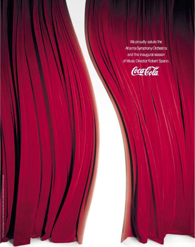
Because come on, sometimes the thing that’s going to best get the job done — the thing that’s going to best convey the brand spirit — is going to be a thing that doesn’t adhere strictly to the brand standards. Like, for instance, the ad that inspired this post. The story, as provided to me: Way back in the day, when a dear friend was but a baby copywriter (Marc, may I?), he and his art director created this ad for the ASO Playbill to promote Coca-Cola’s sponsorship. And it’s clearly beautiful. Look at it. Look at the elegance of it. Look at that sublime incorporation of the iconic Coca-Cola swoop. Look at that…
… logo violation, technically.
Because brand standards call for the swoop to only be horizontal, and this one was, clearly, vertical. And everyone rightfully loved the ad, even the marketing director, because look at it, and yet it still had to get bounced around departments and all the way up the ladder to the CEO, who said, “Are you stupid? It’s perfect. Run it.” (What he actually said was, “It’s a no-brainer,” but I like my version better.)
Anyway, the ad ran as-is, because they weren’t, in fact, stupid and because if you’re so carved-in-granite beholden to your own brand standards that you hold them inviolable even when violating them is the objectively best way promote said brand, you’re going to miss out on great stuff. And yes, this is just one execution in one very, very limited publication, but here are three other examples of brands that shoved their brand standards in a drawer for an afternoon (or should have done) and were better for it.
Hit: S’mOreos
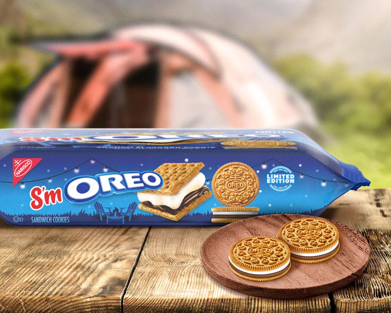
S’mores Oreos were released in 2015, which is proof that God loves us and wants us to be happy. They were delicious, because of course they were, and inspired, because of course they were, and they really had only one flaw: They were called S’mores Oreos.
Like, what the crap, Oreo.
Is the Oreo brand longstanding and well-established? Of course it is. Does it come top-loaded with Swiss-bank-account levels of brand equity? It sure does. But that arguably makes it even safer to slightly diverge from brand standards, because what do you have to lose? O noes, my brand has become diluted because I stapled two letters onto the front of my logo for the purpose of one limited-edition product. The sky, she is falling.
Luckily, for the 2023 rerelease, Oreos came to their senses. Thus: S’mOreos.
The important thing is you got there eventually, Oreos.
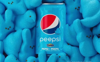
Miss: Pepsi x Peeps
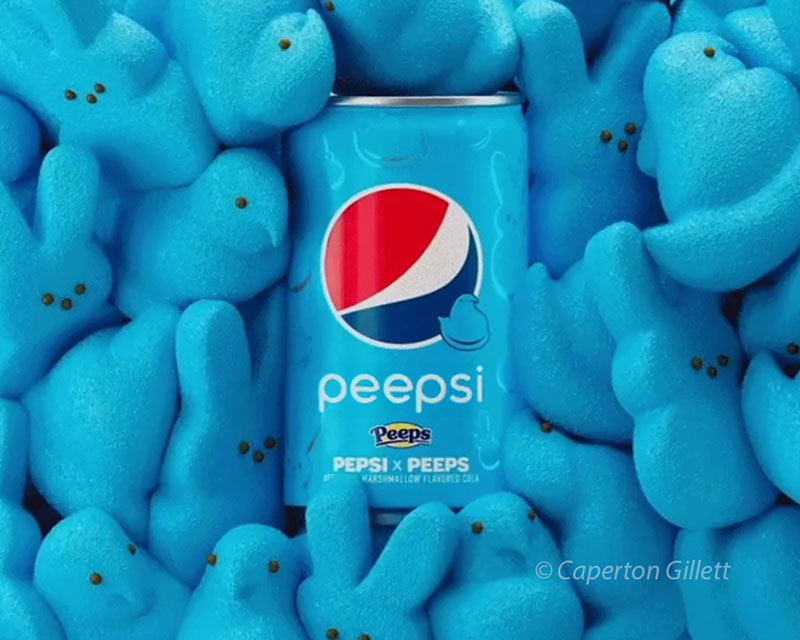
In diametrical contrast to S’mOreos, we have the brand partnership God never intended. It was released in celebration of spring, in the runup to the 2021 Easter holiday, although it sounds like it should have been April 1-only.
The unholy union of Peeps and Pepsi was introduced along with a sweepstakes inviting fans to Tweet photos of them enjoying (hurk) a crisp, refreshing can of Peep-flavored Pepsi with the hashtag #HangingWithMyPEEPS, which is brilliant, because I can’t imagine a reason to consume this abomination if some kind of reward wasn’t available at the end.
But the worst part of it? Even worse than Peeps trying to make PEEPSONALITY® a thing?
They didn’t call it Peepsi.
It’s RIGHT THERE. And there’s no reason not to go for it. I mean, the quote-unquote “beverage” was released in custom mini-cans, so it’s not like packaging changes were an issue for them. And if they were worried about brand dilution, I think the diabetes-bomb of a brand collab already chipped away at brand integrity enough that doing something fun isn’t going to do any more damage. Save what you can and burn the rest. Peepsi.
Home run: FCK
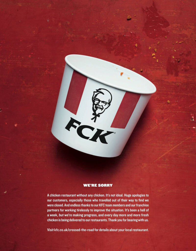
I mean.
Story time: In 2018, literal weeks after KFC UK announced its fancy new logistics partnership with DHL, DHL began fumbling the ball (but, like, the soccer ball) in its delivery of, y’know, food to KFC restaurants, resulting in restaurants being unable to serve, y’know, food to their customers. In the face of mass outrage and hashtags like “#KFCCrisis,” KFC worked with its creative agency, Mother, to find a way to address angry chicken fans in the wake of the cluckup.
Thus.
And while I can 99.99% guarantee that this particular application of the logo isn’t included as appropriate usage in the KFC brand manual, it’s what the moment called for, and it was awesome. It’s an all-time AIWIM favorite of mine, and I can only imagine the concept bouncing around departments and all the way up the ladder to the CEO, who said, “Are you stupid? It’s perfect. Run it.”
(Probably not. Probably, the CEO had spent the past week yelling into the phone what was written there on the bucket and had no FCKs to give about what the creative agency was doing to save the brand. But it remains a no-brainer.)
Remember, kids: Always most of the time follow the brand standards usually.
First, I do have to take a moment to present kudos to Arby’s’ — sorry, no, WArby’s’ — April Fools Day 2018 stunt. Obviously no, a Warby Parker x Arby’s brand mashup doesn’t make a whole lot of sense in the grand scheme, but I celebrate whoever came up with the idea and the length both marketing teams went to to make this seem like a reality. I mean, there’s taking a gag too far, and then there’s taking it the proper amount of way too far. (Plus, the campaign came with logo-themed merch with proceeds going to two charities. That’s good stuff, y’all.)
Overall, consider this your reminder not to prioritize the brand standards over the actual brand. Sometimes, the logo can accept a tweaking, and the chicken bucket can almost-but-not-quite cuss, and the mashed-up brand can’t possibly be worse than the product itself. It’s better to go out-there and get pulled back than to go safe and wonder what you might have been able to accomplish if you hadn’t. Shoot for the stars, land on the moon, blah blah blah.
If violating brand standards is wrong, which it by definition is, I don’t want to be right.