I mean, kind of, pretty much.
The change doesn’t apply to all of Facebook — it only applies to Facebook’s overall corporate body, and the app’s name will remain the same. And it doesn’t not make sense to choose to establish a separate brand for it. The company appears to have a lot of ambitions that reach beyond the standard scope of even an elaborate social media platform, and I’m not going to try to ding them for not wanting to dilute their existing brand.
I will ding them for their completely transparent attempt to distract from All The Issues related to data privacy and to contributing to political polarization and radicalization and the spread of misinformation, because, dude, all you did was make yourself look desperate as well as questionably ethical. Really, the most interesting distracting factor is the fact that the rebranding was attempted so ham-handedly as to make them look incompetent, too.
(For the uninformed, the name “Meta” is already in use by a tech company that does augmented reality stuff, and that is currently suing Facebook. And there was already a tech startup called Meta PC that had filed for the Meta trademark, although they’ve said they’re willing to sell. And an entertainingly snarky German company with a migraine app says Meta stole their logo. And Hebrew-speaking users are joking about how “Meta” sounds like the Hebrew word for “dead,” so… yeah, hit that sucker out of the park, Zuck.)
So, yeah, the fact that the entire rebrand seems based around Zuck group-texting the entire company with HEY, YOU KNOW WHAT WOULD BE COOL? and no one bothering to contact an IP lawyer about it before they shot an announcement video is notable. The fact that the company has ongoing investigations into their algorithms, advertising practices, protection of user data, content moderation, misinformation management, and harboring of far-right conspiracy fomenters while Zuck jingles his keychain and says “Look over here!” is notable. And the fact that Facebook’s customer base hasn’t exactly been saying “Man, Facebook just doesn’t encompass enough of my life” anyway is also notable.
Like, 3/10 on the rebrand, is my point.
Facebook, of course, is hardly the first company to attempt a rebranding under questionable circumstances. Rebranding-as-distraction is a not-uncommon method of addressing PR crises of all levels. Here are five examples of such noteworthy company rebrands, in descending order of malevolence and egregiousness.
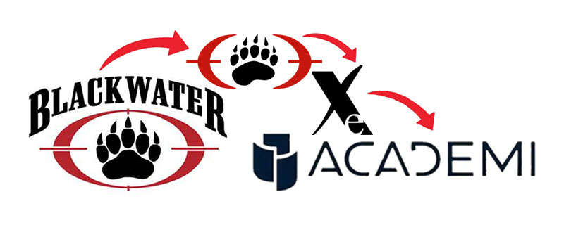
Level 4: Blackwater USA becomes Blackwater Worldwide becomes Xe becomes Academi
Yeah, I know this one is a pretty big one to start with, and please don’t think I’m accusing Facebook of committing war crimes. (For serious, lawyers, DON’T THINK I’M ACCUSING FACEBOOK OF BEING AS BAD AS BLACKWATER.) (Honestly, though, are we sure Facebook has lawyers? I mean, IP-wise, at least…) I’m just saying that if you’re talking about a name change in the midst of a controversy, you can’t get much more egregious than this one.
In 2003, during the early days of the Iraq War, Blackwater USA was hired as a contractor by the U.S. government for services like protection, training, and murdering civilians. (I’m pretty sure that last one wasn’t actually in the contract, ftr.) In 2007, ‘round about the time they were facing government investigation, civil lawsuits, and potential prosecution for actions that can only be described as “straight-up, openly evil,” the company changed their name from Blackwater USA to Blackwater Worldwide and removed a couple of lines from the logo to make it less cross-hairsy. (Great job, guys. Super subtle.)
Then, in 2009, as they were hemorrhaging U.S. government contracts, they rebranded again and restructured, this time as Xe, which is actually pretty clever from a branding standpoint because looking at it, you don’t know how to say it, and hearing it, you don’t know how to spell it, so it’s hard to straight-up accuse them of, y’know, war crimes. And then, in 2010, as they were paying fines for arms trafficking and facing investigations about bribery and settling lawsuits about murder and sex trafficking and smuggling, they were bought by private investors and renamed Academi.
So while the name “Blackwater” is still synonymous with straight-up evil war crimes, they’re still able to be, like, “Blackwater who? Never heard of ‘em. We’re Academi. We’ve never been accused of any war crimes. Hey, look over there!”
But to be clear, this is an extreme example of the idea of rebranding to detract from controversy. Such examples are rare. Much more common are examples in the area of…
Level 3: Google becomes Alphabet
We now move into the non-war-crime portion of the evening (and the one that’s most analogous to Facebook’s current efforts). Technically, Google didn’t become Alphabet. Much like Facebook is currently trying to do, in 2015, the company that was Google abruptly reinvented itself and reorganized under a new parent company with six subsidiaries, and that company was named Alphabet.
“Alphabet,” as a name, didn’t exactly hit it out of the park — why? What does it mean? (And it did get some brand infringement friction of its own.) But it got the job done, particularly because basically no one in the general populace really interacts directly with Alphabet to any considerable extent and thus doesn’t really have to care about the name.
The renaming made sense — again, like Facebook, the company that was Google was expanding into a lot of areas outside of search, like AI and self-driving cars. Splitting them up maintained the brand integrity of Google as a search-focused entity, it insulated the various new subsidiaries from failure by other subsidiaries, and it allayed some of the concerns that were being scrutinized by the SEC, particularly about general transparency and possible monopoly. Yeah, remember those? When Google bought Nest and was suspected of trying to own All The Things? Google’s restructuring and renaming legitimately addressed antitrust concerns, but it also shifted public attention away from that flagship brand and onto this other company with the meh name.
Essentially, the Google/Alphabet rebranding is what Facebook(/Meta) wishes it could accomplish.
And then we have…
Level 2: Kentucky Fried Chicken becomes KFC
There’s certainly a difference between federal investigations and just producing a product that features prominently in every episode of My 600-Lb. Life. Kentucky Fried Chicken — y’know, the company that fries chicken and sells it to people — wasn’t really trying to escape any kind of controversy when it unceremoniously changed its name to KFC in 1991. (Although they also didn’t mention that the change also concerned trademark issues with, of all things, the state of Kentucky).
And, I mean, most people were already referring to it as “KFC” by that point anyway. But the reason for the change was that fried chicken kind of has a reputation for being a heart attack in a bucket with a side of mashed potatoes, and as the market was starting to pay more attention to things like health and wellness, Kentucky Fried Chicken was trying for a healthier, more contemporary image. By dropping “fried.”
Because the people walking out of the restaurant with 5,000 calories of Eight-Piece Fill Up have no idea that those drums, thighs, breasts, and wings are — gasp — fried.
This rebranding stands in contrast to the Facebook name change in that the KFC brand didn’t launch with an awkwardly robotic announcement video featuring Colonel Sanders. (It also didn’t add any healthier options to its menu, ftr.) It just said, “Hey, you care about health, and you’re already calling us KFC, so we might as well go with it, right? No, I’m not hiding a drumstick behind my back.”
And then we also have…
Level 1: Aunt Jemima becomes Pearl Milling Company
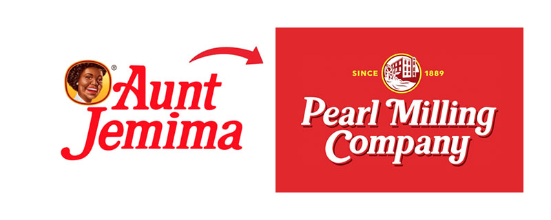
Quaker Oats, makers of the Aunt Jemima line of breakfast products, wasn’t really trying to hide or escape from any kind of major controversy when they announced plans to change said brand back in June of 2020. They pretty much came out and (at long last) acknowledged, “Yeah, using the image of a smiling, enslaved woman to try and sell you pancake mix is not really a good thing, so we’re going to change to something less racist.” This was happening during the period of unrest following the police killing of George Floyd, when more attention was being paid to institutional and casual racism in all aspects of life, and Quaker was being called upon to respond.
On its own, the removal of an anthropomorphic racial stereotype as a mascot for pancake mix is a good thing. (Around this same time, Land O’Lakes dropped the Native American woman from their packaging, and Uncle Ben’s became “Ben’s Original.”) Openly acknowledging that BIPOC people are human beings and not using them as mascots is important. But at the same time, during the period of unrest following the police killing of an unarmed Black man, being all, “Hey, look! No more Jemima! We solved racism!” doesn’t have quite the same impact it might otherwise have.
Regardless, it’s good to see Ms. Jemima being able to retire after 130 years. In February, Quaker finally settled on “Pearl Milling Company,” and even without the name-and-face recognition, the new name still gets the job done, and I doubt there are a lot of people who are now deprived of pancakes because they can’t find the mix without the smiling Black woman on the front. Rebranding was the right thing to do.
And I really have no complaints about…
Level 0: Dunkin’ Donuts becomes Dunkin’
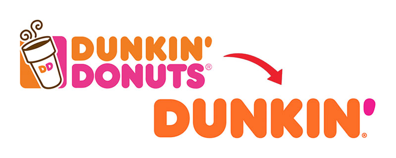
Remember in 2019, when Dunkin’ Donuts dropped the “Donuts” to become just “Dunkin’”? You might not have, because it was done without a lot of fanfare, at least compared to some of the other rebrands on this list. “Out with the old and in with the new,” “Just call us Dunkin’,” and here we are. The change was made in acknowledgment of the fact that the company’s business (not just their product offerings but their actual business, “IHOb”) had expanded considerably beyond just doughnuts, and the old name didn’t represent that.
Does dropping “Donuts” seem maybe a little bit silly when no one’s going to forget that they produce (inferior, cake, long live Krispy Kreme) doughnuts? I mean, no, actually. The fact is, at the time of the change, beverages really were making up half the company’s business. A brand is supposed to convey the essence of the company, and the old one didn’t, so much, and the new one does. And it’s not like there was a full overhaul or anything. They dropped one word and modernized the packaging a little, at a point when most of their customers were probably just calling it “Dunkin’” anyway.
Bonus level: Meta becomes Ready Player Zuck

This one obviously hasn’t actually happened yet, but it should. The thing about this whole “meta” thing is that I do get the concept of Facebook being part of a greater “metaverse.” I don’t know how I feel about it, but the idea of developing other technologies and other spaces for interaction that expand the scope of the Facebook app is an interesting idea, and one that suits the general idea of a metaverse.
A friend recently pointed out, though, that it looks like Zuckerberg is basically trying to bring Ready Player One to life, so I’d like to present Ready Player Zuck as an alternative to Meta, allowing them to skid on past their current IP issues and right into a different set of IP issues. (Must credit Caperton Gillett Creative.)
I also encourage Zuckerberg to re-read Ready Player One and realize what a terrible idea it actually was.
To the rest of the non-rich, non-connected, non-determined-to-invade-every-facet-of-our-digital-lives business community, I encourage you to do just the VERY SLIGHTEST AMOUNT of research before embarking on a rebranding project. And just be straightforward and open about things. Because if you think you’re fooling anyone… you’re not. Like, you’re really not.

Just finished Ready Player Two. Zuck was stealing their plot. I was wondering if anyone else noticed.