

Recently, Cracker Barrel became a source of controversy and not just rustic wooden gee-gaws and heart disease when they hupped and changed their logo, I guess in pursuit of a trendier market for their gravy-fronted cuisine. They paid nearly $700 million to drop the old rocking chair guy in pursuit of an all-text logo that looked, at the risk of slipping into marketing jargon, bad.
Old Rockin’ Chair Guy notwithstanding, the Kountry Kitchen logo reimagining was an interesting choice to accompany their recent Kountry Kohl’s renovations that no one has been clamoring for, and as you might imagine, people disliked it very, very, very much. And in the wake of that $700-million, agency-firing mistake, they changed to logo back all quick-like and made their apologies.
So, that brief national nightmare is over, but Cracker Barrel is merely the most recent examples of brands that have chosen to eff around with their visual identity and find out their market is torches-and-pitchforks attached to that orange with a straw sticking out of it. Here are a few examples.
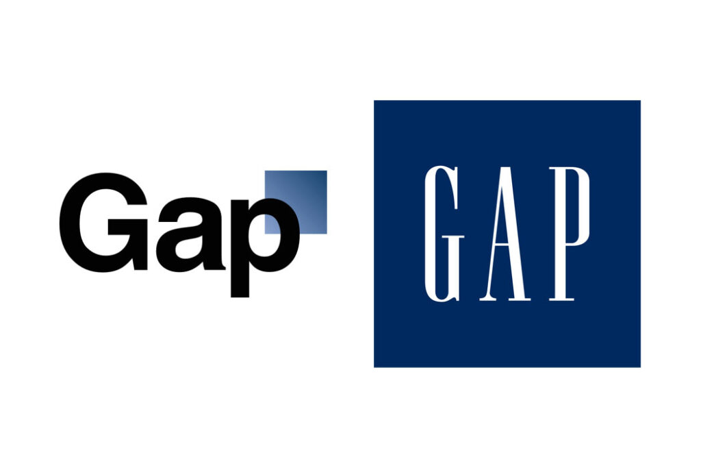
Gap
Of course, if you want to talk short-lived logo reversals, we have to start with Gap’s six-day Helvetica vacation back in 2010. Turns out, “But we still have a blue square!” isn’t a compelling-enough appeal to win over an audience.
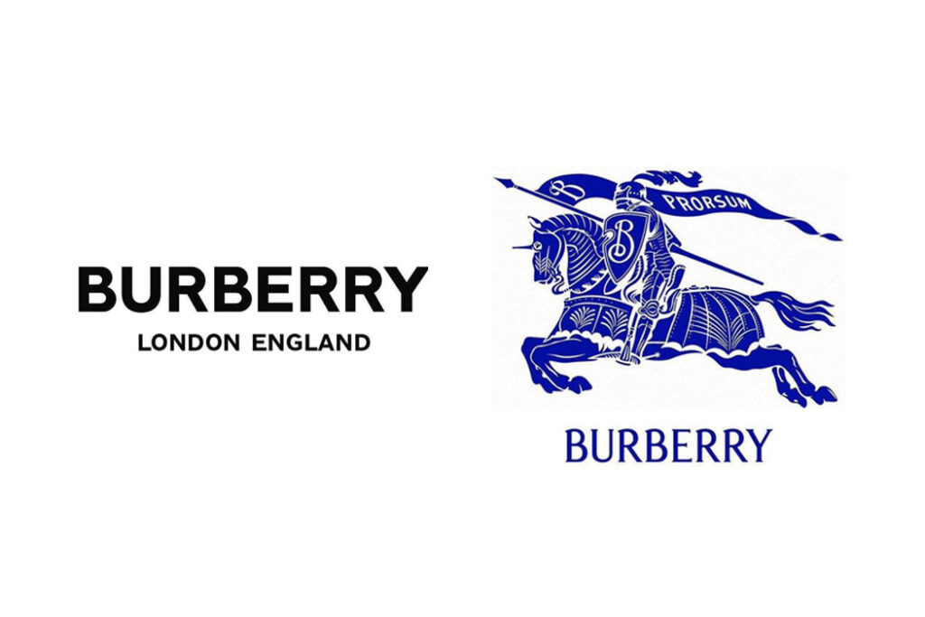
Burberry
Also in the realm of fashion is Burberry’s Riccardo Tisci Don’t Live Here Anymore rebrand. In 2018, under new CCO Riccardo Tisci, Burberry abandoned their century-old serif font and jousting knight in favor of an all-caps wordmark that can best be described as “Arial.” (No shade to Tisci, who wrecked shop at Givenchy — his well-warranted attempts to democratize the Burberry brand did so at the expense of its foundational vibe, is all.)
Under Tisci’s successor, Daniel Lee, the brand cranked back to a refinement of that original 1901 logo, and y’all, I’m not saying it’s perfect, but if they’re going to be moving in a direction of modernization, this is a better starting place than “You know Saint Laurent’s new logo? … Oh, you don’t?”
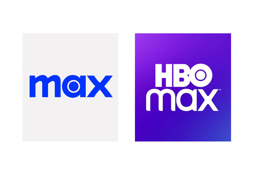
HBO Max/Max/HBO Max again
HBO celebrated its 2023 merger with Warner Bros. Discovery by, as is sadly the case with so many new relationships, abandoning its identity. It removed the HBO from its streaming service HBO Max, leaving it just “Max,” because We’re more than just HBO, y’all!. And then it was Wait, people do like HBO but don’t like HBO+Food Network, and welcome back, HBO Max.
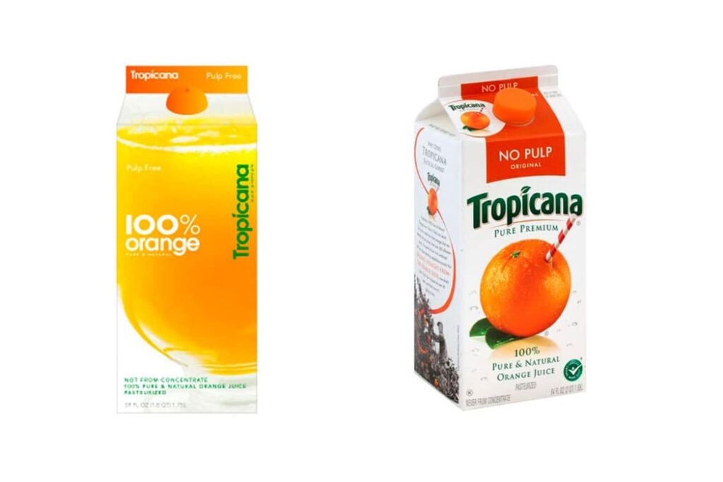
Tropicana
This should surprise no one in marketing, because it’s basically a case study for re-branding cockups, but: In 2009, PepsiCo thought, “The problem with Tropicana’s packaging is it visually indicates what’s inside the bottle.” So they dumped $35 million into a packaging update and accompanying ad campaign, with a big ol’ orange swoop and a ‘00s generic font and a disturbingly biological orange screw cap. They discovered consumers didn’t recognize it on store shelves and even felt emotionally attached to the old branding, so back to the old branding they went. With a $35 million lesson in modernifying without thinking.
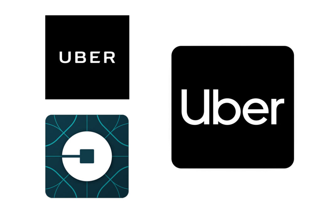
Uber
You might not have noticed Uber’s revolving-door logo journey because your eyes weren’t really focusing well by the time you ordered the car. But in 2016, Uber decided a rebrand was in order to better communicate their mission of… something with bits and atoms, and network infrastructure and something? Key to this was, apparently, kerning, and an icon that looks like a backwards C on an Ikea throw pillow. In 2018, they decided all-caps was the problem, and settled on a logo that actually represents the service you’re trying to use.
I’m bored, and everything should cater to that.
The takeaway here is that brands have gotten boring and I don’t like it, and I don’t care that logos have to be streamlined for a digital environment, because it’s boring and it makes me bored. There’s streamlining, and then there’s prioritizing utility over visual identity that’s representative of the brand itself (and don’t give me that whatever about “our transformation to a more modern blah blah blah and a sophisticated audience that yadda yadda” — I write brand rationales, too, and I know about the pump-jug of Trite BS under your creative director’s desk).
Anyway, make things like I want them to be, and if you have an hour and six minutes of “let’s get better at marketing” time, spend it watching oldish but good “Brand Management: Dropping The Stupid Stuff” from marketing guy Mark Ritson.
(I’ll confess that Burberry’s rebrand was the impetus for this entire post, and I’d love for anyone with connections at Diane von Furstenberg to let them know their 2017 logo redesign looks like they accidentally hit “fully justify” and then got distracted before they could change it back. I’ll take this shit from Calvin Klein, DVF, but you should be ashamed of yourself.)