
The new year has always been a time for new beginnings, life improvements, commitment to something better. Why? Because. Because it just has. We see the fresh calendar, and we think, “This is the year I’m going to finally do the thing I also said I’d do last year around this time, and the year before that.” (Fun fact: this past Sunday was National Quitters Day, so it’s possible that all those new beginnings have ended anyway.)
(Negative Nancy, at your service.)
(Should I resolve to be less negative?)
(Eh, not gonna.)
Several brands have decided they, too, are up for a fresh start and have rebranded for a New Them in 2021. (I’m told that Dell has gone vegan and IKEA has signed up for pottery classes.) Has it worked? Sometimes. Here are two brands’ new year’s revolutions.
Burger King
Burger King has totally changed up their visual identity, top to bottom, and I’m here for it.
Their stated goal was to go for a design that’s “mouthwatering, big and bold, playfully irreverent, and proudly true.” And they nailed it. Ditching their 21-year-old logo in favor of throwback branding is, indeed, a super-fun choice, while still evoking the company’s trusted and beloved history. In their new visual identity, Burger King has gone retro with the color palette, the typeface, the flat design, and other graphic elements, and I’m into it.
I’m not going to lie: There’s a possibility that what is currently very appealing to me (and, apparently, many others) will, over time, feel outdated. That’s a problem you run into when you bring in throwback branding — it comes pre-dated. But even I, Negative Nancy, am not going to bash the brand for a problem that hasn’t occurred and may not occur at all. I think it’s quite groovy.
Also: the monogram with the B as a burger and the K in the middle? ADORABLE.
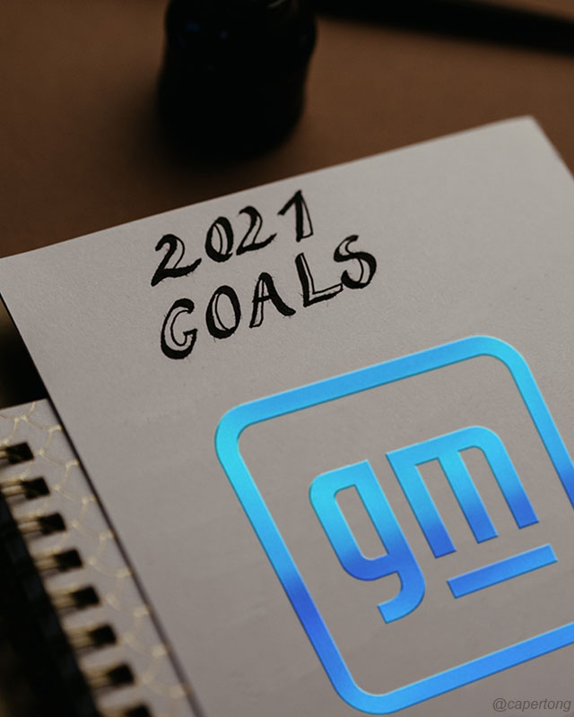
General Motors
General Motors’ new, “modern and vibrant” brand is meant to reflect, among other things, the company’s commitment to responsibility, particularly in their new Ultim tech that powers their new electric vehicles.The old, straightforward sans-serif capitals on a field of blue have been replaced with lowercase letters on a field of white in a metallic-looking blue gradient.
It looks like an elephant.
Not even sorry. Not sorry about my opinion, and not sorry about the fact that you’ll now never be able to un-see the elephant.
I will say that the new logo is, in fact, modern and vibrant. I just don’t see it for a car company — even an electric-car company. I can see it selling me printers, or logistics services, or maybe a photo-editing app. But I don’t really see it selling me cars, and I definitely don’t see it as the purveyor of a lifted Yukon Denali. Your brand is meant to represent you. It’s meant to represent your history, your culture, everything you have to offer. It’s meant to evoke familiarity and trust. And unless GM is planning to phase out their fossil-fuel-fueled vehicles entirely and start over as, in essence, a brand-new company, this new logo only really represents something they’re hoping to be. Also, it’s an elephant.
I don’t disagree that, with its new attention on sustainability and electric vehicles, a rebrand was in order for General Motors. It seems reasonable. And just as I’d never tell a friend not to change their hairdo if they think they’re ready for an update (unless bangs are involved), I’m not going to tell a company not to rebrand if they think theirs is getting a little stale. But I will tell my friend if I think ash blonde isn’t a good color on them, and I’ll tell GM that their new logo doesn’t look like them but does look like an elephant.
The good thing here is that GM doesn’t use its own logo on car badges — they all get their own brand — so we won’t be seeing a Sierra 1500 driving around with a metallic blue elephant on the front. The GM elephant will appear on corporate documents and websites and such, but it won’t be trundling around on city streets. And there’s an all-black, non-gradient version that I think looks a lot stronger and a lot more “GM.”
For their part, GM appears to love-love their new logo, and the designer is exceptionally proud of it, as she should be — it’s cool-looking, and whether or not all her thought came across, she clearly put a lot of thought into it. I love me some thoroughly thought-out creative. Explain every single detail of your concept to me, and I will buy you a coffee every time.
But still, just… nah.
A New Me
Ha! Not really. My only resolution this year, as in years past, is to continue being awesome. And I, thank you very much, have kept it going long after Quitters Day.
Did you make any resolutions this year? Have they held up so far? Good for you if they have, and don’t worry about it if they haven’t. Here’s a resolution for you: In 2021, resolve to be a cute little burger made of letters, not a gradient elephant. And if someone in your life doesn’t understand that, dump ’em. You don’t need that kind of negativity.
(But for real, you see the elephant, right?)